A great SEO audit will consider and analyze every ranking factor Google uses. The mobile experience is high on that list, given that so much search occurs on handheld devices now.
So in looking at what should be included in an SEO audit, mobile usability is a must have. Further, it should go a bit beyond simple yes or no answer as to whether your content passes the grade. Here are some of the critical aspects of mobile friendliness that should never be overlooked:
Content Matching between Desktop and Mobile
Quality content is a cornerstone of ranking high in the search results. So it’s important that both your desktop and mobile experiences deliver the same content to Google, and your users.
We recognize there can be a delicate balance between design/UX and your SEO goals, but the preponderance of websites now face mobile first indexing. With that being the case, hiding content on mobile unnecessarily can hurt your rankings.
That doesn’t mean you can’t display the same content but in a more efficient design for mobile devices. For example, converting a wide table of data into an accordion layout to show each row is a popular middle ground.
If you’ve taken the time to write valuable content, it’s critical to make sure everyone can see it. From humans to bots.
Is the Smartphone Googlebot Finding & Using your CSS

When you load up your website on your phone, you hopefully love the way it looks. At the same time, the way some WordPress, Shopify, and other platforms structure things, it’s possible Google isn’t seeing the CSS files used to style your site.
That can lead to a bunch of worrying errors in your Google Search Console, and hurt your rankings.
To see if this is happening to you, use the Google mobile friendly test located here.
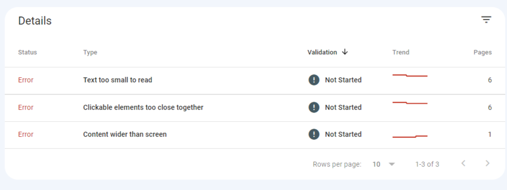
You may see errors like:
- Text to small to read
- Clickable elements too close together
- Content wider than screen
There might not be anything “wrong” with your site at all, and the user experience is great. So what gives?
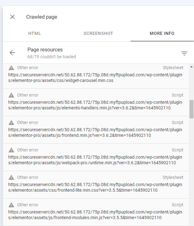
Web browsers are one thing. Bots and spiders are another. Check the live version of your page in Google Search Console if you are seeing errors. Under “More Info”, you’ll see resources the Googlebot couldn’t load when it tried to access the page. If that list includes CSS and Javascript files, it’s very likely Google is seeing the page MUCH differently than you are.
Our audit looks at all these issues, and suggests ways you can fix them.
Is Your Search Console Mobile Usability Report Passing
So as mentioned above, Google is very likely crawling your site “mobile-first”. That can throw errors in your Search Console, hurt your rankings, and in this context, ruin your user experience.
In optimizing your site for organic search, start with the small screen.
Let’s assume you’ve passed the first two tests above. Your SEO audit should then dive in to see if there’s an actual problem with your code, and point out what those issues are. Often, it’s some very simple CSS fixes, but your Dev team may not see them if they’re not considering different browsers and different mobile devices while building your site.
There are thousands of combinations out there. Your code needs to play nicely with all of them. And that might even mean the folks still inexplicably using Internet Explorer on a 12 inch CRT monitor. (Although don’t spend too much time worrying about that…)

Your Next Steps
Go log in to Google Search Console and check the Mobile Friendliness reports, or ask someone on your team to do so. If there are issues, see if you can work through them with your Devs.
If not, it may well be time to bring in an expert to get under the hood and have a look.
Our team has fixed these kinds of issues for hundreds of sites, and we’ve seen what problems can arise if it’s not done correctly. Ready to get ranked? We’re ready to help.


